Friday, August 31, 2012

How To Make Photo Greeting Cards


If you have visited my Etsy shop, Jay J Studio, you have seen my collection of photo greeting cards.  If you would like to try your hand at making your own personalized photo cards, the process is very simple.  The items you need to make the cards are:

1) The photo.  This could be a new digital photo that you get printed through Shutterfly or Walgreens, or an old photo from back in the days of film that you have in an album.  Tailor your photo to the person who will be receiving the card.  Maybe a photo of them as a child, or their wedding day, or the two of you having fun.  This makes the card special as well as one-of-a-kind.


2) Card stock.  You can find pre-scored card stock at any of the bigger craft stores such as Jo-Ann's or Michaels, or at your local craft store (I get mine from Ben Franklin in Oconomowoc, WI).  I prefer these to the window cards you sometimes see because they're far cheaper.  For around $10 you can get 25 cards with matching envelopes in either white or cream.  Make sure you buy the correct size card for your photo.  If you have a 3 1/2" x 5" photo buy 4" x 6" card stock.  4" x 6" photo, buy 5" x 7" card stock.  You want to make sure you have a nice border for your photo, plus if you use a card the same size as your photo, you run the risk of the photo not being centered on the card stock, even with the steadiest of hands.


3) Paper cutter (optional).  If you are like me and like to print your own photos, you may find your finished photo may not fit exactly on the photo paper you use.  I usually crop my photos in the printing software to make sure the photo is just as I envisioned it, and that usually means white space around the photo.  Use a paper cutter, which you can find at any craft store, to slice off any white space you have.  If you are using cream-colored card stock, this is especially important.  But if you are using white card stock, you may just want to keep the white space.


4) Adhesive.  It is important that you use the right adhesive to get the photo to stick to the card stock and stay there.  Do NOT use ordinary scotch tape.  It is not safe for photos, and even though you can't see damage right away, over time it will destruct your photo.  Instead, use a photo-safe double-sided adhesive, like Scotch brand photo splits.  You can use the individual splits and put them on the corners of your photo to attach to the card.  Or, what I like to use is the Photo Splits Applicator (below) which works just like a white-out dispenser. 


Now that you have all of your materials, you can start making the card.  As I said above, if you print your own photos, go ahead and cut off any of the white space around the photo.  Using the paper cutter takes practice to figure out where to line up your photo for cutting.  If you are still seeing white space after you cut, just snip it out with scissors.


Then apply the adhesive to the back of the photo.  This adhesive also works well to mount a photo to matting.  Just make sure in that case to apply the adhesive to the matting instead of the photo so you won't see any of the adhesive show through when you frame it.


If you are using the Photo Splits Applicator, just run it along all four edges of the photo.  If you accidentally run the applicator past the photo (I have done this), it's really easy to just pull the split off of the edge.  Just make sure you do it right away before it settles.


Once you have added your adhesive, steadily mount the photo onto the card stock, making sure you have it in the right position.  It sometimes helps to fold the card along the scoring line first to make sure you can see it and position accordingly.


And there you have it!  A finished photo card that's just you.  I guarantee your friend or relative will not have another card like yours.  They might even want to frame it later.  And don't forget the envelope.  But most of all, have fun with it and make it your own.


Wednesday, August 29, 2012

Ornaments of the Hood


This is my very first Alphabe-Thursday, and this week's letter is "O".  So, I was having a hard time coming up with a subject that began with "O" until I started looking through my online folders of pictures and remembered I had taken some shots of hood ornaments at the Waukesha Old Car Show at Frame Park earlier this month.  I love how hood ornaments back in the day were sleek and Art Deco in nature, like small sculptures.  So enjoy these few hood ornament photos, and I'll be back to Alphabe-Thursday next week for "P".


Sunday, August 26, 2012

Huzzah! My Very First Trip To The Bristol Renaissance Faire


Yesterday, I once again braved another hot Wisconsin day to attend the Bristol Renaissance Faire for the very first time.  The Faire is located outside Kenosha, Wisconsin, 30 miles south of Milwaukee, and it is celebrating its 25th Anniversary. 

As a Theatre major in college, I kind of knew what to expect.  But, there were some surprises as well, which made it a fun experience.  If you yourself have never attended a renaissance fair, here is a list what you would expect to find there.

1) Actors in costume everywhere.  That's what makes the faire so much more unique than your typical festival.  All of the actors I encountered were really friendly.  They will interact with you, try to make you laugh, show you their skills, and they don't shy away from photo-ops, just like these folks:


Some of the actors even walk around on stilts:


2) Beautiful costumes, like those found in period movies.  And there is a wide array of types of costumes worn by the actors.  Most of the fair-goers dress up too, which adds a whole other aspect to people watching:


If you show up to the fair and feel out of place with your t-shirt and jeans, you can even rent a costume for the day:


 3) Fun statues:


 4) Music, of course:


5) Many stages of entertainment, from skits to comedy to swordsmen:


6) Knights on horseback:


And in the jousting ring.  This was the main event for me yesterday, since I had only seen jousting a little bit on TV.  They first had a skills joust:


Then the knight-to-knight joust:


7) Food - all kinds of it.  While the most popular item was the Turkey Leg, there was also shrimp or vegetable tempura, sandwiches, crepes, fried fish, onion strings, and it wouldn't be a Wisconsin festival without these:


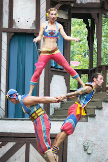
8) Acrobats and Animals (there was also a petting zoo and camel rides):


Well, there is a rundown of what you can expect to find at one of the many renaissance faires around the country.  Google Renaissance Fairs to find the one nearest you.  The Bristol Renaissance Faire has one more weekend of activity over Labor Day weekend.  To find out more, visit: http://www.renfair.com/bristol/.


Friday, August 24, 2012

Guitar Town Statues Round 2


Last June, my hometown of Waukesha, Wisconsin was named a Guitar Town by Gibson Guitars, since Les Paul, the inventor of the electric guitar, was born here and is buried here.  To celebrate the honor, many local artists created special guitar statues, some small, some 10-feet tall, which are now prominently displayed throughout the downtown area. 

While the festival to celebrate the unveiling of the larger statues was a lot of fun (please see the original post at http://artphotocraft.blogspot.com/2012/06/my-hometown-guitar-town.html to get the full story), it was very crowded.  In fact, I hadn't seen that many people in downtown Waukesha since we helped celebrate Harley Davidson's 100th anniversary.  This made getting prime photographs tough.  So I went around town and took some better photographs of some of the statues in their new homes. 

The first statue, above, was designed by Ramona Audley and is located in front of First Federal Bank on Wisconsin Avenue.  To see more of her work, visit http://www.gallery1art.com/Ramona.html.


The guitar above, featuring the face of Carlos Santana, was designed by Ben Stark, and is located near the Fox Riverwalk in front of Waukesha State Bank. 


This beautiful guitar, featuring a hummingbird, was designed by Marcia Schneider, and it has a very high-profile place in the middle of downtown's restaurant district.  To see more of Marcia's work, visit http://www.almontgallery.org/artists_mschneider.htm.


This guitar with the tiger was designed by Gene Evans of Milwaukee.  It also has a high-profile spot located in front of the Waukesha Historical Society on Main Street.


I have included a few more of the guitars from the June festival, since I thought these were really nicely done by the arists.  The one above was designed by Bill Reid.  To see more of Bill's work, visit
http://www.toryfolliard.com/sculpture/Bill-Reid.shtml


This guitar was one of my favorites, designed by Jennifer Espenscheid.  To see more of Jennifer's work, visit http://www.thesomagallery.com/.


The one above was designed by Chuck Weber, a well-known Waukesha artist who's work is featured at Almont Gallery downtown.  I loved this guitar so much, and the photo turned out so well (if I do say so myself), I framed it and it is hanging in my living room.  To see more of Chuck's work, visit http://weberportraits.com/.

I am still in awe of these artists' work even after nearly 3 months of seeing them on my city's street corners.  And these were just the tip of it.  In addition to the 10 large guitars, there are 17 standard-size Les Paul Gibson guitars on display throughout downtown featuring more hand-picked artists' work.  To get a full list of guitars and where to see them, go to http://www.waukeshaguitartown.com/.

Photo Friday: Quiet


For more entries in this week's Photo Friday, visit http://www.photofriday.com/.

Wednesday, August 22, 2012

Daring To Be Different At The WOCC Car Show

 
Anyone who has seen the other posts on this blog knows I love classic cars.  And the best place I found so far to see a wide variety of these beauties was at the Car Show In The Park, sponsored by the Waukesha Old Car Club.  It was held August 12th in Frame Park along the Fox River in downtown Waukesha, and due to the park's size, was so big and full of classic cars, I think I saw only about 75% of them. 
 
Instead of featuring the more commonly seen classic cars, I decided to focus this post on the more unusual entries I saw that day.  The car above really caught my eye the moment I saw it, not only because I love to watch surfing competitions on TV, but also because of the fun, bright colors.


 This produce delivery truck even featured a price board of what the items would have cost in the 1930's.


At first, I thought this car was just old and rusty when I went up to it.  But as I was standing taking photos, someone mentioned that this car had survived a fire and that's what caused the rusty look.


This car was quite a show-stopper.  It not only had boot-leather type seats, but fringe on the bumper.


This was another car that caught my eye immediately from farther down the line.  I think I heard that the owner keeps the wind-up on the car at all times, not just for the show.


The last two cars here are not unique, but I loved the designs, and especially the colors.  Turquoise is my favorite color.


It was another fun day taking photos at the WOCC Car Show in the Park.  So much so, I ran through my battery and had to use my Android phone to take some more photos.  I may feature those on a future post if they turn out well. 

For more information on the Waukesha Old Car Club, visit http://www.waukeshaoldcarclub.org/.